
aRTIE ART GALLLERY
RESPONSIVE WEBSITE

Overview
Artie is a fictional, municipally owned small art gallery that I created as the basis for this responsive website as part of the Google UX Design Professional Certificate on Coursera. In addition to the website I created an Artie app.
Challenge
Create a responsive website that showcases art, without visually overwhelming users, and ensure users are able to both find relevant information about things like exhibits and events, while also allowing for rich browsing of content.
Role
Product Design, Visual Design, UI Design, Research, Wireframing, Prototyping, logo and icon design
Approach
I started by conducting comprehensive user research to understand users, while also performing a competitive analysis of existing art gallery websites. From there, I crafted initial wireframes and low-fidelity prototypes, which I shared with users to identify usability challenges for the different screen sizes. Based on feedback from these sessions, I refined the design and developed high-fidelity prototypes, integrating visual elements that addressed the users’ needs. After conducting further usability testing, I made final refinements to ensure the design was both user-focused and aligned with the gallery’s objectives.
Results
The Artie website helps users find what they are looking for, like specific information about exhibits and events, while also allowing for the discovery of new art and artists.
Understanding the User
In order to glean user needs and wants for the Artie website I conducted interviews, created journey maps, personas and empathy maps.

Empathy Map
User Interview Questions
What is the main information you would be looking for on the website?
Do you already have an idea of what you will see at the gallery?
What do you want to know prior to visiting?
How often do you visit this art gallery?
Do you visit mostly visit with friends, family or solo?

Persona
Competitive Analysis
To understand the art gallery space and it’s users I conducted a competitive analysis of art galleries and their websites. Among sites I studied were: The Royal Academy (London, UK), The Whitney (NYC, USA) and the AGO (Toronto, CA).
The websites all had rich imagery, and a great deal of information about exhibits, events, artworks and specifics about the gallery’s physical spaces.

Paper Wireframes
Using the information I gathered from users and the competitive analysis I worked through ideas creating paper wireframes.
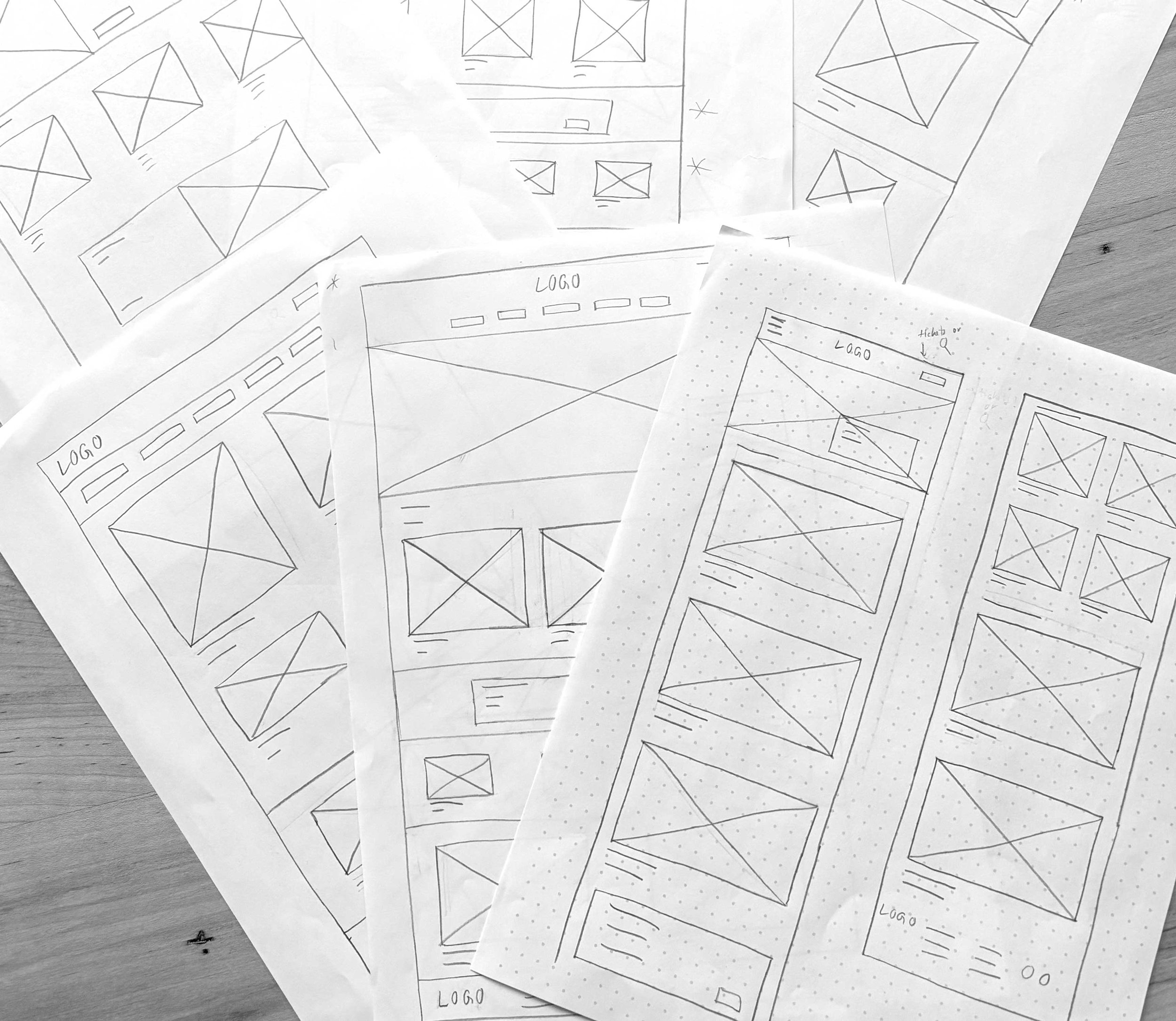
Low-fidelity Wireframes
Having created different options in paper wireframes I moved on to low-fidelity digital wireframes. I refined the layouts and created interactive prototypes.

sitemap
Here I have created a site map laying out the sites structure.

Usability Study
I asked participants in my usability study to navigate the website and complete various tasks like finding specific exhibits, events and purchasing tickets.
Participants thought the drop down menu was unnecessary since the site’s content was shallow enough to have a second tab menu that would also allow users to move between sections more easily.

Desktop Mockups
Below are mockups for the Exhibits page and a specific exhibit details page, as well as the events page and the detail page of a specific event.


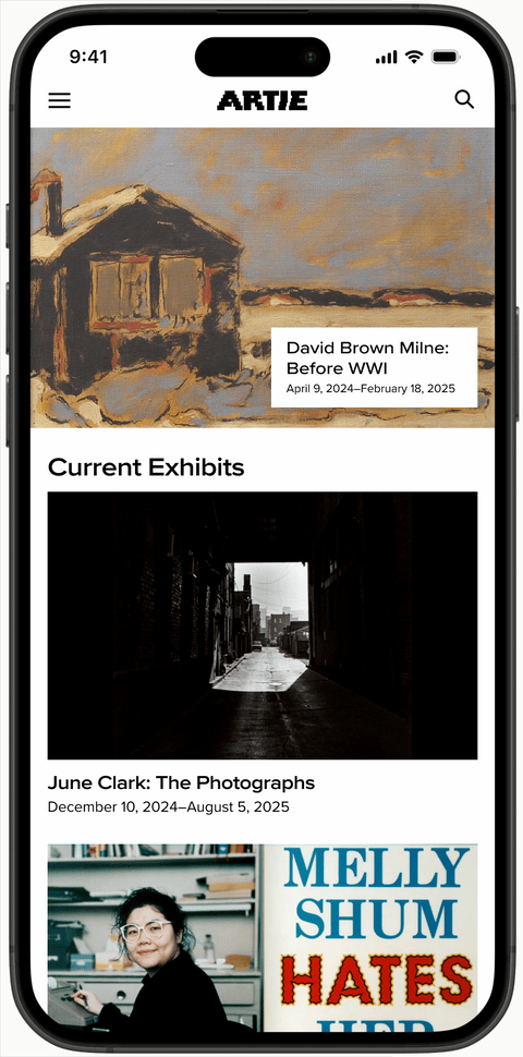
Mobile Mockups
In mobile you can see that the hero image spans the width of the screen and below images are nearly the width of the screen. Scrolling further down to lower section there are two images in each row.


Style Guide
The letters in the logo are made up of overlapping landscape and portrait rectangles—a callout to the typical shape and orientations of paintings.
I kept the primary colours to black, white and gray to work well with the many colours of the many works of art that will be showcased in the app.
The secondary colours are bright to create a sense of fun and reduce any anxiety visitors may have about any perceived lack of knowledge when it comes to art since it can be intimidating for many. These bright colours are also a way to guide people through the app and often provide a contrast to the colours in art. All colours are named after commonly used fine art paints. I have ensured that the colours will work together for adequate colour contrast for text so that it is accessible for all.

Mobile Mockup
The homepage of the website in mobile. A user clicks on the flyout menu and selects events and views the detail page for an event.
Desktop Mockup
Looking at exhibits and reading about a specific exhibit.

Takeaways
Designing a responsive website is challenging for many reasons from needing a design to function at the different sizes to the different use cases for users. They may be planning ahead on a desktop or walking down the street looking for something to do. In addition the age and technical abilities of users is quite vast, as well as their general interest and reason for going to the site.
Next steps
I would invite UX/UI designers to give feedback for improving the design and functionality of the website and implement necessary changes. With updates in place I would conduct further usability testing and refine the design. To make a more engaging site I would integrate more rich content such as blog posts and artists spotlights.